Serif fonts
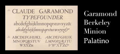
Old style
They were first used in history long time ago when
publishing was really just getting started. Italian printers were interested in
creating a type that was easy to read for book printing. Old style typefaces
are very easy to read in printed form and that’s because there’s not a large
difference in contrast in the thickness of the lines or strokes. Examples,
Garamond, Berkeley, Minion, Palatino etc
Transitional
They are established in the mid-18th century and
they are between old style and modern fonts therefore the name transitional.
The contrast or the difference between the thickness of the lines and the
characters are more dramatic with transitional serif. Instead of harsh endings
transitional fonts tend to end with ball terminals. Ball terminals are the
rounded ends of the type stems as supposed to the rough end.
Didone/Modern
These are characterized by even more dramatic contrast
between the thickness and thinness of the lines. They are a highly stylized and
they’re commonly found in high end fashion brands because there is a high
contrast between the thickness and thinness of the lines. It could put more
dramatic spacing between the character to create a dramatic effect. Examples,
Didot, Bodoni (commonly found in design programs as a default option) etc.
Slab serif
Very different from its predecessors, this font was originally
designed to demand one’s attention on poster designs. They have very thick bold
lines with almost zero contrast chunky thick and bold. They certainly grabbed
our attention throughout the years. They even use this serif on wanted posters
back in the old west and the designers use slab serif for the same reason. We
have a political statement a slab serif might be a good way to command one’s attention.
Examples, Rockwell, Archer, Archer pro etc.
Sans-serif
They tend to have a more modern clean and sleek appearance
but they can sometimes lack subtle elegance or charm needed in a particular
situation. They have no tails accents at the end of characters that look clean
and simply. They can convey a sense of modernism and minimalism. They are
originated at much later than its their predecessor because the use of digital
and computer screens required a more clean and simple font. Back when computers
had a low resolution display the small details and the serif fonts were lost
and thus the need for a more simple sans-serif fonts.
They can fantastic for big bold headlines but for small body
copy that comes in large blocks of text. They can sometimes get lost. They are
great for websites and digital medias. But for print projects that require
large blocks of text sometimes serif font works a little better but it depends
on the mood and style you’re going for.


ConversionConversion EmoticonEmoticon